Publications: Cincinnati Jazz

This was a concept peice I created for a fictional magazine called Cincinnati Jazz. I created everything on these peices from the photography to the design. I used a Minolta D7 digital SLR to take the photos, Photoshop for the photo editing and cutouts and I used InDesign to create the layouts.
Publications: Westminster Transfer
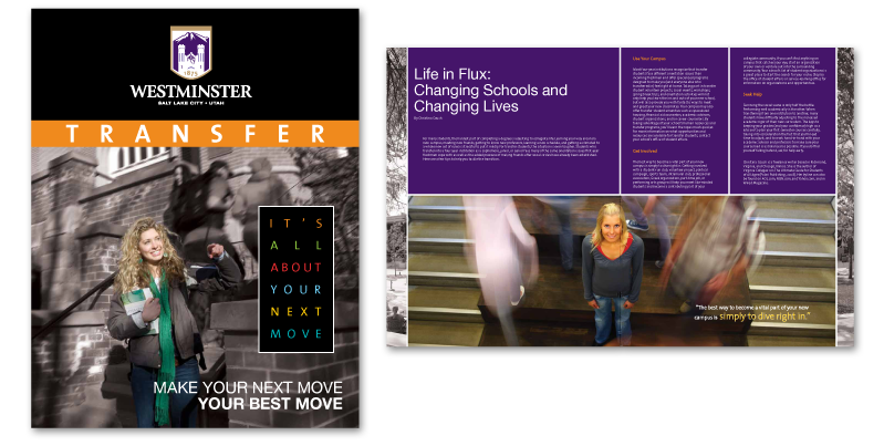
This example is from a 16 page UBC (university branded collateral) that I created for Hobsons. I create and update UBCs ranging from postcards to 32 page magazines. For this project I used InDesign and Photoshop.
Publications: Naviance Summer Institute
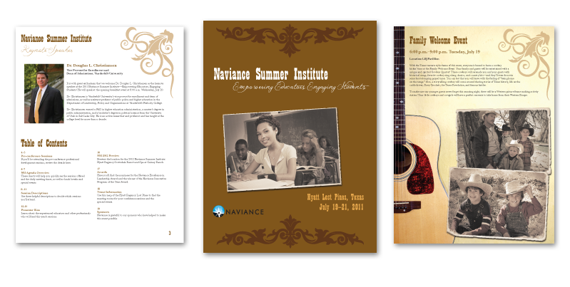
These pages are from a 20 page program I created for the Naviance Summer Institute. The conferance was in Texas, so it had a south-western theme and design. I created an old-timey effect on most of the images in the piece. I used InDesign and Photoshop.
Posters

I often get to create posters for local music venues, organizations and ensembles. On the left is an example I created for the Blue Wisp Jazz Club promoting Joey DeFranceso. To the right is an example I made for Brent Gallaher. I used Photoshop and Illustrator to create the artwork, and for Brent's poster I also did the photography using a Minolta D7 digital SLR.
Posters
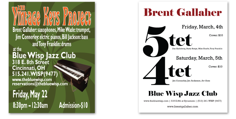
Two more examples of my poster work. To the left is a poster I created for the Vintage Keys ensemble. I was requested to use a 1970s kitchen green, which is nice complement to the theme of the band. To the left is another Brent Gallaher poster. For this I wanted to play off the different ensemble size and make a musical/visual play off of the meter signature of 5/4. I was inspired by the simplicity of Milton Glaser's "I ♥ NY" design. I watched a documentary on him where he said one of the most powerful ways to present a message is with a puzzle. I have received many compliments for this poster. I used Photoshop and Illustrator in the creation of these posters.
Album Art: What Goes Up
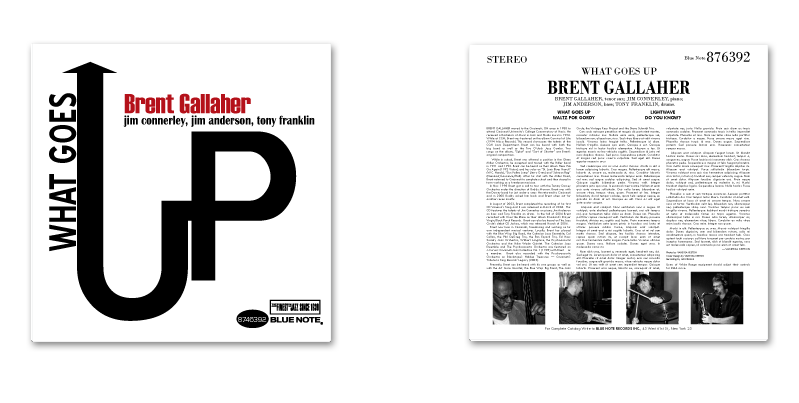
Blue Note was not only known for producing amazing recordings during the height of the jazz era, but also for the amazing cover art on its albums. This cover was a school project that I still think is one of the coolest things I've done. I wanted to pay homage to Reid Miles with this cover and took the idea completely from his work on Joe Henderson's In 'n' Out cover. I created this in Illustrator and used Photoshop to crop and edit the photos that I took on a Minolta D7 digital SLR. This actually inspired Brent Gallaher to get in the studio, and although he was not successful in writing a tune for this title, the next slide shows the result of the session.
Album Art: Lightwave
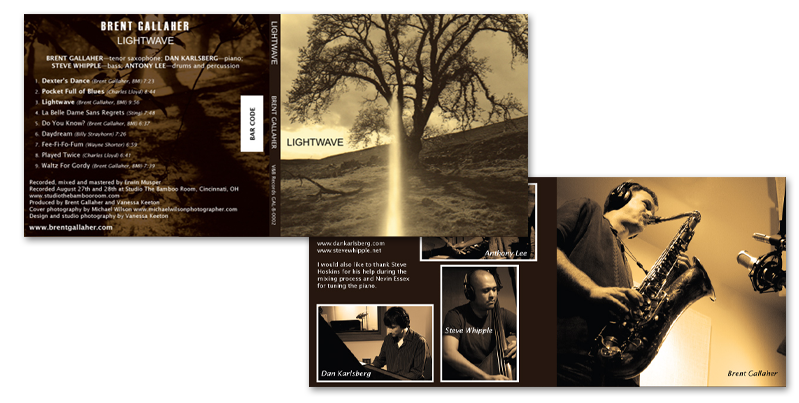
Lightwave was the result of Brent Gallaher’s desire to make What Goes Up a real record. The outside cover images are by Michael Wilson and the inside cover images are mine. Again, they are shot on a Minolta D7 digital SLR. The layout was created in Illustrator and the photos processed in Photoshop.